The Challenge
Design systems often break down when scaling across multiple apps and platforms. Every new product squad I joined spent the first sprint on the same setup — tokens, Storybook, theme toggles, starter components — before touching any real product features. I wanted to eliminate that entirely.
What is the need
Every new product squad I joined ended up spending the first sprint doing the same setup work — pulling design tokens into Style Dictionary, wiring up theme toggles, configuring Storybook, and re-creating the same five starter components from scratch. By the time we had the demo app, Playwright tests, and build scripts running, we still hadn’t touched any real product features.
So I decided to fix that.
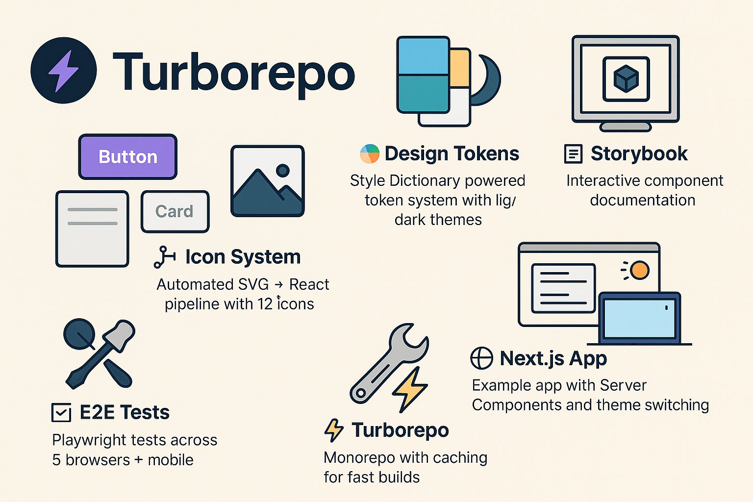
I built the create-my-design-system starter CLI. a ready-to-use base that includes everything a team needs to start building from Day 0 — without repeating setup tasks every time:
- 🎨 Design tokens via Style Dictionary with light/dark themes
- 🧩 A component library with five production-ready React components
- 🖼️ An icon system that auto-converts SVGs into typed React components
- 📖 Storybook docs with live theming and MDX pre-configured
- 🌐 A Next.js example app using Server Components and theme switching
- 🧪 Playwright E2E tests across desktop and mobile browsers
- ⚡ Turborepo orchestration and caching right from the first build
Now, instead of bootstrapping the basics, teams can run one CLI command, get a full design system setup instantly, and focus on building actual products.
Quick start
npx create-my-design-system acme-ui
cd acme-ui
pnpm install
pnpm dev          # Next.js app + Storybook
pnpm --filter e2e test
- Dev server surfaces run at
http://localhost:3000(app) andhttp://localhost:6006(Storybook). - Additional helpers:
pnpm build,pnpm lint, andpnpm formatkeep the workspace consistent.
What you get
Apps
apps/web— Next.js 15 reference app with Server Components and a theme toggle baked in.apps/docs— Storybook, preloaded with MDX docs and accessibility tooling.apps/e2e— Playwright workspace targeting Chromium, Firefox, WebKit, and mobile presets.
Packages
design-tokens— Style Dictionary pipeline that emits CSS variables, Tailwind config, and TypeScript helpers fromcoreandsemanticJSON sources.ui— React component library (Button, Text, Input, Card, Modal) compiled viatsupas ESM and CJS bundles.icons— Automated SVG → React pipeline with typed exports andcurrentColordefaults.eslint-config&typescript-config— shared configs that keep every package aligned.
Developer experience
- Guided CLI prompts (project name, description, author, preferred package manager).
- Optional
--no-install/--no-gitflags for teams embedding the generator inside their own automation. - Turborepo orchestration with caching so repeated builds stay fast.
Design token pipeline
graph LR
    A[Edit tokens/*.json] --> B[Style Dictionary]
    B --> C[CSS Variables]
    B --> D[Tailwind Config]
    B --> E[TypeScript Types]
- Tokens are split into
coreprimitives and theme-specific JSON files (light.json,dark.json). pnpm --filter design-tokens buildregenerates outputs, including the Tailwind utilities (124 classes) showcased at/tokens-verify.- Generated artefacts:
dist/css/tokens.css,dist/css/theme.css,dist/js/tailwind.config.js,dist/types/index.ts.
Components & icons
- Components demonstrate accessibility-first patterns: tokens drive spacing/typography, icons slot into inputs and buttons, and variants map directly to semantic tokens.
- Adding a component is documented in Storybook: create the source file, register it in
tsup.config.ts, and expose it viapackage.jsonexports. - SVGs dropped into
packages/icons/src/svgare cleaned with SVGO, converted by SVGR, and typed automatically so consumers get IntelliSense via the generatedIconNameunion.
Theming & documentation
- A shared
ThemeProviderkeeps the Next.js app and Storybook in sync; toggling light/dark simply flips the<html>class. - Creating a new theme involves adding a semantic token file plus a Style Dictionary config—no code changes in consuming apps.
- Storybook runs alongside the app (
pnpm dev) with MDX docs, responsive viewports, and a11y checks so design reviews stay grounded in the same primitives shipping to production.
Testing & quality gates
- Playwright launches the Next.js app and runs regression suites across Chromium, Firefox, WebKit, plus Pixel 5 and iPhone 12 emulations.
- Tests lean on accessible queries (
page.getByRole,page.getByLabel) to guard UX rules as well as functionality. - Failed runs capture screenshots, videos, and traces;
pnpm --filter e2e test:uiopens the interactive runner for debugging.
Shipping & maintenance
- Changesets manages semantic versioning. Run
pnpm changesetafter features,pnpm version-packagesto update manifests, thenpnpm releaseto publish. - GitHub Actions validate lint/build/test on each push, raise the “Version Packages” PR, and publish to npm using
NPM_TOKEN+GITHUB_TOKEN.
Daily workflow
pnpm dev— Start Next.js + Storybook.pnpm --filter <package> build— Rebuild tokens, UI, or icons in isolation.pnpm typecheck— Run TypeScript across the workspace.pnpm clean— Clear caches and build artefacts.pnpm format/pnpm lint— Keep the repo consistent before shipping.
Architecture snapshot
design-tokens ─┬─▶ ui ─┐
               │       ├─▶ apps/web (Next.js)
               │       └─▶ apps/docs (Storybook)
               └─▶ icons ┘

apps/e2e depends on the built web app for Playwright runs.
Key files
turbo.json— task graph + caching strategy.pnpm-workspace.yaml— declares workspace packages.packages/design-tokens/*.config.js— Style Dictionary builds per theme.packages/ui/tsup.config.ts— component build targets.apps/docs/.storybook/main.ts&preview.ts— Storybook bundler + decorators.apps/e2e/playwright.config.ts— browsers, retries, reporters, and dev server hooks.
Live demos
- Next.js playground: my-design-system-demo.vercel.app shows tokens, themes, and UI components in production.
- Storybook docs: my-design-system-doc.vercel.app mirrors the same theme toggle and props explorer the team uses daily.
- Published CLI:
create-my-design-systemis the package teams install.
What I Learned
The hardest part of design systems isn't building components — it's building consensus. Technical architecture matters less than documentation and adoption strategy. Shipping a CLI that teams can run in one command removed the biggest barrier: getting started.